
GMAT Data Insights: The Complete Guide
If you’ve started prepping for the GMAT and you’ve hit the Data Insights section, you’ve probably had one of two reactions. Either you thought, “Okay, this looks doable,” and then got three questions in and quietly panicked. Or you looked at a sortable table with 40 rows of data and thought, “Wait, this is on the GMAT now?”
You’re not alone.
Most students walk into Data Insights having never seen anything quite like it before
Not in school, not in other standardized tests, nowhere. And because it’s unfamiliar, it’s also the section people prepare for the least, even though it counts just as much toward your final score as Quant or Verbal.
That’s really the whole point of this guide. By the time you’re done reading, you’ll know exactly what Data Insights is, what each of its five question types actually wants from you, and how to build a study plan that gets you comfortable with it. Not just a plan that has you reading about it and hoping it clicks on test day.
This guide is built from the same material we use to teach Data Insights in our live GMAT classes at EliteGMAT. Table Analysis, Two Part Analysis, Graphics Interpretation, and Multi Source Reasoning are all full chapters in our course, not an afterthought. So this isn’t a rehash of what’s already out there. Let’s get into it.
What Is GMAT Data Insights, Really?
Here’s the simplest way to think about it: Data Insights is the section GMAC added when they rebuilt the GMAT into the “Focus Edition” back in 2023. It replaced the old Integrated Reasoning section, and it also absorbed Data Sufficiency questions, which used to live inside the Quant section.
Why did they do this? Because business schools told GMAC something pretty simple. The real world doesn’t hand you a clean math problem with one right method. It hands you messy data from three different sources and asks you to make a decision anyway. Data Insights is GMAC’s attempt to test exactly that skill: can you look at real, sometimes cluttered information and pull out what actually matters?
Here are the facts you need to know, laid out plainly:
- 20 questions in 45 minutes. That’s a little over 2 minutes per question on average, though as you’ll see below, that average hides a lot of variation.
- Scored on a 60 to 90 scale, the exact same scale used for Quant and Verbal.
- It counts fully toward your total score. This is a big shift from the old Integrated Reasoning section, which used to be reported separately and mattered a lot less to most schools. Data Insights doesn’t get that pass anymore.
- You get an on screen calculator. A lot of students don’t realize this and end up doing painful mental math they didn’t need to do. Use it.
The one thing worth sitting with here: because DI is scored exactly like Quant and Verbal now, you genuinely can’t treat it as an afterthought anymore. Ignoring it, or hoping you’ll “just wing it,” is a real risk to your total score. That’s the whole reason this section deserves its own study plan, and its own guide.
The 5 Question Types Inside Data Insights
Data Insights isn’t one uniform question style. It’s five different formats, each testing a slightly different skill. Let’s go through each one so you know exactly what you’re walking into.
1. Data Sufficiency
This one’s actually not new. It used to live in the Quant section, and GMAC moved it here in the Focus rewrite. The format is unusual if you’ve never seen it: you’re given a question and two statements, and your job isn’t to solve the problem. Your job is to decide whether each statement, alone or together, gives you enough information to answer the question. You never actually calculate a final answer.
Think of it less like solving math and more like a process of elimination game. You’re constantly asking “does this statement alone answer the question? What about this one? What about both together?” There’s a standard way to work through the five answer choices (usually taught as the “AD/BCE” approach), and once it clicks, it becomes one of the more mechanical, learnable parts of DI.
Common mistake: assuming information you weren’t actually given. Students bring in outside assumptions, like assuming a number is positive, or assuming a variable is a whole number, when the statements never said that. Stick strictly to what’s written.
We’re building an interactive Data Sufficiency practice set right now. We’ll link it here the moment it’s ready.
2. Table Analysis
You’ll get a table full of data, rows and columns, sometimes 20+ rows, and a handful of statements you need to mark true or false based on what’s in the table. The table is sortable by any column, and that sort function is not optional decoration. It’s the entire point of the question type.
The skill being tested here isn’t math. It’s speed and discipline in how you use that sort function. Students who try to eyeball a 30 row table looking for the highest value almost always make mistakes or waste time. Students who immediately sort by the relevant column get the answer in seconds.
Common mistake: not sorting at all, and instead scanning the table visually trying to “spot” the answer. This is slow and genuinely error prone. Don’t do it.
Want to feel this for yourself? Try our interactive Table Analysis practice set →
3. Graphics Interpretation
Here you’ll get a chart or graph along with one or two sentences that have a dropdown blank in them. You pick the correct word or value from the dropdown to complete the sentence accurately based on the graph.
What surprises a lot of students is just how many different kinds of graphs show up here. It’s not just one type of chart repeated twenty times. You’ll see bar graphs, line graphs, scatter plots, bubble charts, pie charts, and statistical distribution graphs like box plots or histograms, and each one “communicates” in its own way. A scatter plot tells you about a relationship between two variables. A pie chart tells you about proportions of a whole. A line graph tells you about change over time. If you treat all of them the same way, you’ll misread more than you’d think.
The real skill here is reading the graph correctly before you touch any data. Slow down at the start, not the end.
Common mistake: rushing past the axis labels and units. A graph showing “revenue in thousands” versus “revenue in millions” completely changes what a correct statement looks like, and students often skip straight to the shape of the graph without checking what it’s actually measuring.
Want to feel this for yourself? Try our interactive Graphics Interpretation practice set →
4. Two Part Analysis
This one feels like a small logic puzzle. You’re given a scenario and asked to answer two related sub questions, and you pick your answers from a shared table of choices, one column for each part.
The key thing to understand is that the two parts are connected, not independent. What you decide for part one often directly constrains or informs part two. Students frequently solve part one, feel satisfied, and then answer part two as if it’s a totally fresh question. That’s where the mistakes creep in.
Common mistake: treating the two parts as separate questions instead of one connected problem. Always ask yourself how your answer to part one affects what part two can or can’t be.
Want to feel this for yourself? Try our interactive Two Part Analysis practice set →
5. Multi Source Reasoning
You’ll see multiple tabs of information. This could be a mix of text (like an email or memo), a table, and maybe a chart, and then several questions that draw on that combined information. This is the question type that most closely resembles reading comprehension, except the information is scattered across tabs instead of one passage.
The skill here is resisting the urge to read everything closely upfront like you would a passage. Instead, skim to understand what each tab contains, then read the actual question first, and go hunting for the specific piece of information you need. Trying to absorb every detail before you even see the question wastes precious time.
Multi Source Reasoning also tends to feel like the “hardest” of the five, and there’s a reason for that. It often borrows a bit from everything else, reading carefully like Data Sufficiency, comparing data like Table Analysis, and sometimes even reading a small chart embedded in one of the tabs like Graphics Interpretation. It’s less a standalone skill and more a combination of everything you’ve already built.
Common mistake: reading all the tabs word for word before looking at the questions, the way you might approach a Reading Comprehension passage. Data Insights rewards a “search and find” approach, not a “read everything carefully” approach.
Want to feel this for yourself? Try our interactive Multi Source Reasoning practice set →
How Data Insights Is Scored (And Why That Changes Your Strategy)
Data Insights is scored on the same 60 to 90 scale as Quant and Verbal, and all three combine into your total 205 to 805 score. So far, that’s simple enough. But there’s one detail that trips up a lot of students, and it’s important enough to call out clearly:
Many DI questions have multiple parts, and you usually need to get every part correct to receive any credit at all. Two Part Analysis has two parts. Multi Source Reasoning sets have multiple questions tied to one set of tabs. There’s typically no partial credit for getting some of it right. That’s a real shift from how most students are used to thinking about test questions, and it means carelessness on “just one part” of a question can cost you the whole thing.
There’s also a pacing implication here. Not every DI question takes the same amount of time. A straightforward Data Sufficiency question might take under 90 seconds. A dense Table Analysis or Multi Source Reasoning question can reasonably take 2.5 to 3 minutes. If you try to pace every single DI question at a flat “just over 2 minutes,” you’ll end up rushing the harder formats and wasting time on the easier ones. Learning roughly how long each question type should take you is part of the preparation, not something you figure out live on test day.
Is Data Insights Hard? (Honest Answer)
Let’s not dodge this one. Is Data Insights hard?
Honestly, the underlying math is not harder than what you’ll see in the Quant section. There’s no advanced concept hiding in Data Insights that you haven’t already dealt with in some form. What makes it feel hard is that the format is unfamiliar. You haven’t spent years of school practicing sortable tables and dropdown based graph questions the way you’ve practiced algebra.
Unfamiliarity feels like difficulty, but it’s not the same thing.
And that’s actually good news, because it means Data Insights is highly learnable. It rewards students who build a repeatable process for each of the five question types, not students who are naturally “gifted with data” or who’ve worked with spreadsheets before. If you put in the reps on the process, the section stops feeling foreign fairly quickly.
How to Actually Study for Data Insights
Here’s a study approach that works, broken into steps. This is close to how we structure the Data Insights chapters in our own course, so if any of this feels a little detailed, that’s on purpose.
Step 1: Study the question types in the right order, not randomly. The order you learn these five formats in actually matters, and we teach them in a specific sequence for a reason. We start with Graphics Interpretation, then move to Two Part Analysis, then Table Analysis, and finish with Multi Source Reasoning.
Here’s the logic behind that order. Graphics Interpretation comes first because reading data visually and accurately is the most basic skill the whole section depends on, and it builds the habit of slowing down before you touch any data, a habit every other question type also needs. Two Part Analysis comes next because it introduces the idea of two connected decisions on one screen, a small step up in complexity, without yet asking you to manage a large table. Table Analysis comes third because it demands active data handling, sorting, comparing, filtering, and that’s easiest to pick up once you’re already comfortable reading data carefully and thinking in connected steps. Multi Source Reasoning comes last on purpose, because it borrows something from every question type before it. By the time you reach it, you’re not learning a new skill from scratch, you’re combining skills you’ve already built.
Step 2: Learn the theory for each question type, and each of its subsections, before you time yourself. Within each of the five types, there are subsections worth learning individually. Graphics Interpretation alone covers several different diagram types, bar graphs, line graphs, scatter plots, bubble charts, pie charts, and statistical distribution graphs, and each behaves a little differently. Learn the process for each subsection on its own instead of lumping them all together.
Step 3: Practice untimed, and focus only on accuracy. This step gets skipped constantly, and it’s a mistake. Students want to start timing themselves right away because the real test is timed. But if you’re still making process errors, adding a timer just makes you fast and wrong. Get accurate first, ideally with 5 to 10 practice questions per subsection, done in a screen format that actually looks like the real GMAT interface. Practicing on a plain worksheet doesn’t prepare you for a sortable table or a dropdown menu the same way practicing on the real format does.
Step 4: Add timing gradually, one question type at a time. Once you’re consistently accurate on a given type, start timing just that type. Then move to the next one, following the same Graphics Interpretation, Two Part Analysis, Table Analysis, Multi Source Reasoning order.
Step 5: Move to official questions, and review every single one in detail. Once you’ve built comfort through practice questions, shift to official GMAT Data Insights questions for each type. Don’t just check whether you got them right. Go through each one and understand exactly why the correct answer is correct and why every wrong option is wrong. This step is where real, lasting improvement happens.
Step 6: When you review wrong answers, separate the two possible reasons. Every mistake on a DI question falls into one of two buckets: either you misread the data (a careless or rushed error), or you didn’t actually know the right process for that question type (a knowledge gap). These need completely different fixes.
Step 7: Finish with full length, mixed practice sets. Once you’re solid on each type individually, do practice sets that mix all five types together, the way the real exam will throw them at you.
A Real Story: How Kamakshi Went From the 14th Percentile to a 99th
Sometimes the best way to explain a method is to show you what it actually did for someone.
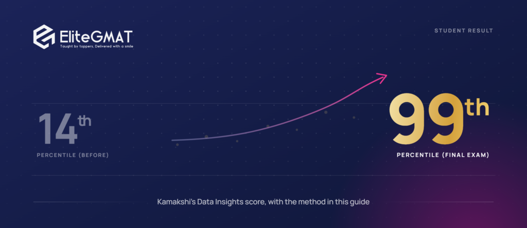
When Kamakshi first came to us, her Data Insights section was sitting in the 14th percentile, part of an overall GMAT score of 425. She wasn’t struggling because she lacked intelligence or effort. She was struggling because Data Insights was a completely unfamiliar language to her, the way it is for most students, and she’d never been taught it in any structured way. She’d simply been thrown into practice tests and left to figure it out on her own.
So we started from the beginning, and we started slow, on purpose.
We taught her Data Insights in the exact sequence we recommend in this guide. Graphics Interpretation first, then Two Part Analysis, then Table Analysis, and Multi Source Reasoning last. For every single one of those, we didn’t just teach the section as a whole. We broke it down into its subsections. For Graphics Interpretation, that meant going through bar graphs, line graphs, scatter plots, bubble charts, pie charts, and statistical distribution graphs, one at a time, with detailed theory for each before she ever attempted a question on her own.
Once the theory for a subsection was solid, she practiced. Five to ten questions per subsection, every single time, and all of it done on a screen built to look exactly like the real GMAT exam interface, not on paper, not in a generic format. The same pattern repeated for Table Analysis, Two Part Analysis, and Multi Source Reasoning. Theory first, then focused practice, subsection by subsection, in the real exam format, until each piece was genuinely solid before she moved to the next.
Only after all of that did we move her to official GMAT Data Insights questions, section by section. And this is where the real depth happened. We didn’t rush through these. We sat with each one and discussed it in detail, why the right answer was right, why every wrong answer was wrong, what the question was really testing underneath the surface.
Slowly, and then all at once, something shifted. Kamakshi started scoring consistently between the 92nd and 96th percentile on official mock tests in Data Insights. Not once. Consistently. The section that had once sat at the 14th percentile had become one of her strongest.
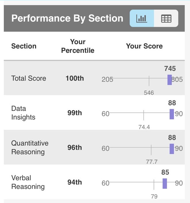
On the actual exam, she scored a 745, and inside that score, her Data Insights section landed in the 99th percentile.
That jump, from the 14th percentile to the 99th, from a total score of 425 to a 745, didn’t happen because Kamakshi suddenly became a different student. It happened because Data Insights was finally taught to her the way it deserves to be taught. Step by step, subsection by subsection, theory before practice, practice before official questions, and real depth at every single stage. It’s the exact method laid out in this guide, and it’s the same method we use with every student who walks through our Data Insights chapters.
Kamakshi’s actual GMAT score report, Data Insights included
Common Mistakes Students Make on DI
Here’s a quick list of the mistakes that come up again and again. If you recognize yourself in more than one of these, don’t worry, they’re all fixable, and just being aware of them is most of the battle.
- Treating it like Reading Comprehension. Over reading every tab or every piece of a table before even looking at the question wastes time you don’t have.
- Not using the sort function on Table Analysis. Trying to eyeball data instead of sorting it is slower and more error prone, every time.
- Forgetting that sub parts usually need to ALL be correct. Getting careless on “just one part” of a Two Part or Multi Source question can cost you the entire question.
- Skipping the on screen calculator when it would genuinely save time and reduce careless arithmetic errors.
- Practicing untimed forever and never actually building real exam pacing before test day.
- Ignoring DI in the study plan entirely because it doesn’t feel like “real” math or verbal, even though it’s worth exactly as much as both.
Quick FAQ
Is Data Insights hard to improve at? Not really, once you understand it’s a skill built through repeatable processes rather than raw talent. Most students see solid improvement once they stop treating it as one big unfamiliar blob and start practicing each of the five question types, subsection by subsection.
Do I need to be good at Excel or data analysis to do well? No. Prior experience with spreadsheets or data tools might make the table format feel slightly less foreign at first glance, but it’s not a requirement. The section tests reasoning with data, not tool familiarity.
Can I use a calculator on Data Insights? Yes. An on screen calculator is provided for the entire section. Use it. A lot of students forget it’s there and do unnecessary mental math.
How is Data Insights different from the old Integrated Reasoning section? Integrated Reasoning used to be scored separately and mattered much less to most schools. Data Insights also absorbed Data Sufficiency questions that used to live in the Quant section, and now it counts fully toward your total 205 to 805 score, a much bigger deal than IR ever was.
What’s a good Data Insights score? Like Quant and Verbal, it’s scored from 60 to 90. Because all three sections count equally toward your total, a “good” DI score really means one that’s roughly in line with your Quant and Verbal scores. A big gap in DI can quietly drag down an otherwise strong total, the way it once did for Kamakshi.
What’s Next
This guide covers the big picture, but each of the five question types deserves its own deep dive, especially Table Analysis, Two Part Analysis, Graphics Interpretation, and Multi Source Reasoning, all four of which are full chapters in the EliteGMAT course. We’ll be publishing detailed, worked example guides on each of those soon, and we’ll link them here as they go live.
If you’d like to see this method in action rather than just read about it, you’re welcome to join a free trial class with us and watch how we actually teach a Data Insights question type live. No pressure, it’s just the fastest way to see whether this approach clicks for you.